H
I
I
,
'
M
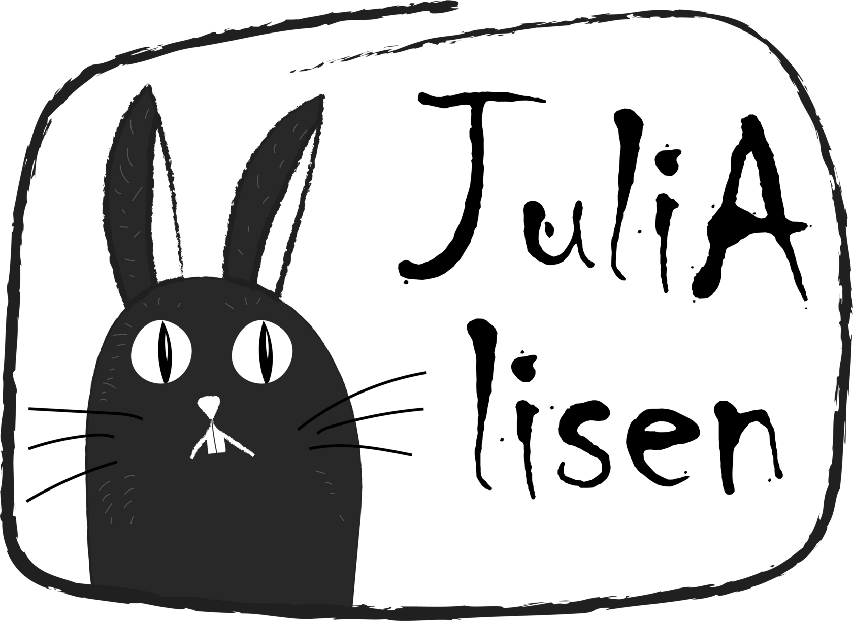
J
U
L
I
A
* ACTUALLY, I'M A WEBSITE.
BUT I WAS BUILT BY JULIA NALIVAIKO
TO SHOW HER PORTFOLIO
BUT I WAS BUILT BY JULIA NALIVAIKO
TO SHOW HER PORTFOLIO
Editorial Layout Project: Print Collateral Design
Task: Design a 24-page brochure, two-fold leaflet, double-sided business card, and bookmark calendar with a unified visual identity.
Concept: The layout draws inspiration from Soviet editorial design of the 1960s — structured grids, clear typography, and balanced composition.
A two-column system, paragraph styles, and accent inserts reflect the aesthetics of that era while keeping a modern precision.
Result: A consistent, thoughtful design that merges retro editorial principles with contemporary clarity and print accuracy.
Cluckn Cook.
Artisan cuisine.
Task: Create a visual style for signature cuisine that conveys home warmth, naturalness, and a modern approach.
Logo: A stylized chicken — a symbol of coziness and homemade food.
Its slightly funny, friendly look adds lightness and joy.
Solution: Packaging and media share a unified identity: clear typography, natural colors, and light illustrations.
Deliverables:
- primary logo + 4 product-specific logo variations
- ouality-mark labels and minimalist stickers for various dishes and products
- packaging layouts for multiple SKUs
- business card design
- weekly menu sample (typeset)
- custom pattern for flexible application across touchpoints
- instagram: profile visuals and post templates
Berry Nook.Illustrations for a brand
of handmade jam.
Task: Develop a cozy and appealing identity for homemade jam.
Logo & Style: Illustrations were chosen as the core visual element because they create an emotional connection with the consumer, evoking warmth and authenticity.
Solution: Natural colors, playful details, and hand-drawn aesthetics highlight the homemade character and variety of flavors.
Result: A charming, memorable brand that conveys comfort, naturalness.
Publication in Creativepool
Interview: “From Sketch to Shelf: Jam Brand Concept”
Outlet: Creativepool, 11.2025
Link: https://creativepool.com/creativepool-editorial/articles/from-sketch-to-shelf-the-making-of-julia-nalivaykos-illustrated-jam-brand-concept.33854
Other projects -
packaging and illustrations
1. Yogurt Packaging
Bright and natural packaging design for a yogurt brand. Focus on freshness, simplicity, and appetite appeal.
2. Rabbit Feed Branding
A cohesive illustration and packaging system for rabbit nutrition: three age-specific SKUs in 1 kg and 2 kg formats, unified by a playful, nature-inspired style that signals care and quality. The range also features an illustration for a dried-herbs product.
3. Board Game Redesign
Reconstruction of a classic board game: 25 new characters, illustrated backgrounds, and a fresh packaging design.
JULIA is always happy to see new projects
+351 939 947 185
julialisenal@gmail.com
julialisenal@gmail.com
